Friday Chart Book
October 25, 2024
The week started as we checked out in the previous sessions. The bond market is on the back foot, with yield curves steepening. Monday saw a particularly vicious day, where bonds were clobbered hard. My conclusion when talking with a few counterparties was that the trend-following crowd (CTA’s) had to delever their positions, which are still slightly long. Wednesday was the most interesting day, as equities saw their first significant drawdown in quite a while. Similarly, Gold, which seemed bulletproof, also saw a relatively sizeable setback. Luckily, I warned of the reversal ahead of time, powered by the reversal model. What now? Yield curves started fading in late Wednesday trading, which then turned into a mild bull-steepening move on Thursday. The US Dollar also took a breather after quite a rally after the September 50 bps FOMC cut. I will leave details of my bond thesis to another version of “When to Buy Bonds” series, but wanted to showcase the difference the past few makes have made when comparing current yield levels and curves to the day before the Fed’s September 18th meeting.
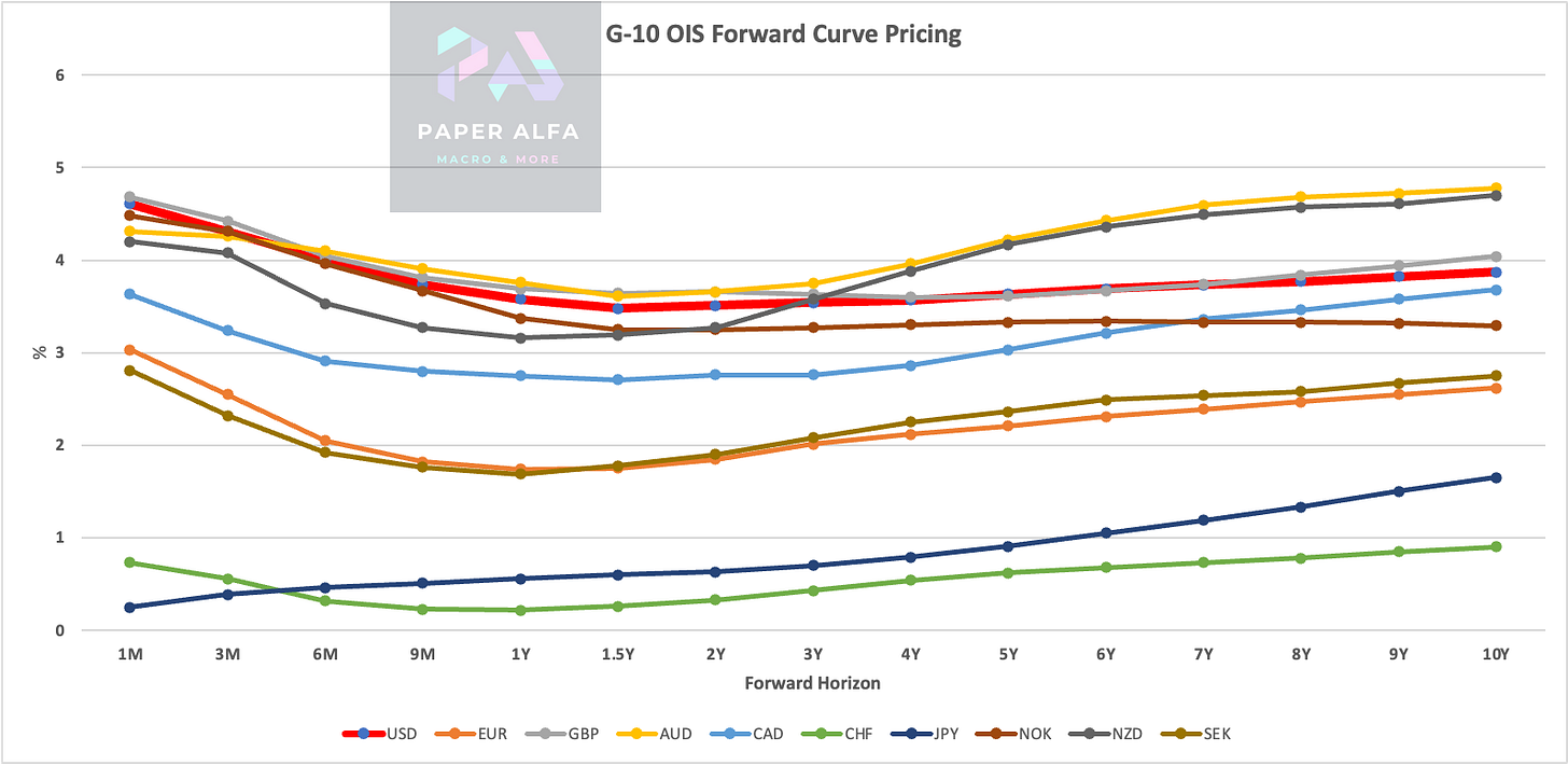
The current G-10 OIS looks like the chart below, with the thick red line being the US.
On a cumulative basis, we see the following picture, where again, the red line shows that we have roughly 125 bps of cuts priced into the curve for the US.
So far, the market has simply reduced the easing priced into the forwards, which has generally still been supportive for equities and risk assets in general.
The change since the FOMC meeting, however, has been quite spectacular. The chart shows, for example, that AUD and USD OIS forwards moved by 50-60 bps higher in the 1-3 year horizons. That’s not insignificant when considering that actual easing occurred at the time.
Are bonds a buy? I will get into this in a separate piece, but according to my models, nominal GDP is currently cruising at 4.5%, precisely where the US 30-year Treasury yield is trading. Forward-looking data does not point to a slowdown, while inflation swaps (see below) have also adjusted higher by around 20 bps, which means real yields tracked higher by roughly 30-40 bps overall.
The overriding question to me is what happens if STIRS decide in a few months’ time to recalibrate from easing to holding to possibly hiking rates again thereby calling the premature end of a truncated easing cycle. I can see this scenario just as clearly as arguing that we are faced with a challenging growth outlook going forward based on how much the easing of financial conditions has effectively helped propel growth. At some point, this won’t continue. Similarly, with nominal rates, especially in the long end, rising sharply over the past few weeks, we will likely see slowing economic momentum in a quarter or two. As such, rising rates are seeding the next bond rally. It’s clear, however, that markets won’t tolerate cuts based on weak arguments, as Powell and his colleagues had to discover. BoC cut 50 bps, and bonds sold off. It’s not a mechanical rally outside of the actual policy rate. Bonds ain’t easy, but lucky for us we have not one but two bond models guiding our path. They are driving the asset allocation model on a weekly basis. I will update it this weekend and include it in Attack the Week (ATW).
Also, with the election approaching, Macro D has kindly projected his thoughts across 3 parts, with the first part reaching us this week. I will release parts 2 and 3 next week.
Enjoy!
By now, most of you will be familiar with the models and their signals. If not, please study the guide I have published. I would highly recommend you go through these notes and guides if you are new to the pack. I am also in the process of making an intra-day model available soon. It’s in the works.
Further below, the full book of 250+ charts covers the whole asset spectrum from equities, bonds, commodities, FX, and Crypto to give you the most extensive view. On average, it will generally provide a good 5-10 set-ups on a weekly basis.
This is a reminder that you can now also use my models in TradingView scripts, which I made available for subscribers to use on their charts. This is not for free and incurs an additional cost. If you are interested, ping me an email with your TV username. Note that only paying subscribers will be granted access. No exceptions. It’s taking time to set everyone up so I will limit the amount of users going forward.
Let’s also read my friend Macro D’s recent thoughts on markets before engaging our scanning eyes across the multitude of charts that I have updated for you below.


