Regimes, Trends & Models
A True Trend is your Friend
We all talk about regimes, myself included. I think it’s one of the most important performance drivers in anyone’s portfolio. Knowing where you are is undeniably important to know where you are going. It is not difficult to gauge in which regime you find yourself in. What is a regime? Mostly, we define it by the varying growth & inflation dynamics. What is the current trajectory of growth & inflation? Both are going up? Growth going up and inflation down is often seen as the current Goldilocks scenario, which highly benefits most asset markets.
However, knowing in which regime you find yourself is not always a guarantee of how assets will perform. Markets are forward-looking and imply regime conditions on a forward basis, while data confirms where the trajectory was with a multi-month lag.
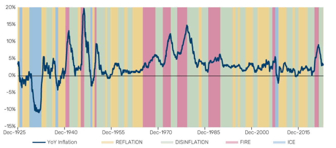
I came across a good research paper by the Man Institute group. It cross-sections regimes by inflationary regimes, which is obviously quite interesting given the current period. They label the four different inflation regimes as FIRE (high inflation and rising), DISINFLATION (high and falling inflation), ICE (low and falling inflation), and REFLATION (low and rising inflation). The following chart describes it using year-over-year inflation.
At the current juncture, we have moved from a fire environment to a disinflationary one, which is rather intuitive. What does it mean for asset market performance? Luckily, the good souls at Man also summarised the “typical” performance impacts in those various regimes, looking at Equities, Bonds, Commodities, Long-Short (L/S) Equity Value, L/S Equity Cross-sectional Momentum and Trend.
The following table summarises the statistics for the inflationary regime analysis. The top half of the table shows real annualised return (strength of state signal). In contrast, the bottom table shows the hit rate (persistence of signal – red or green cells denote those where performance is consistently positive or negative, defined as in more than 75% of episodes).
Unsurprisingly, equities do well in disinflationary and reflationary regimes, while they do poorly in a fire regime, as witnessed in 2022. For bonds, the disinflationary period is seeing higher real returns, while the rate is lower than in a reflationary regime, which is also surprising. Commodities do well in higher inflationary regimes, again, as witnessed in 2022 and what we are seeing again today. Trend following does well in higher inflationary regimes, which usually see higher volatility periods, with overall returns being positive across all regimes for this strategy.
Looking at various growth regimes (see table below), we can again see trend-following strategies perform in all “weather” regimes, with equities only being able to do well in either boom or recovering growth scenarios. Bonds, as a natural diversification hedge, perform relatively well in recessionary conditions.
When looking at various yield curve regimes (Bull/Bear, Steepening/Flattening) for the 3m-10-year slope, equities and bonds tend to perform in either bull steepening or bull flattening regimes. This is unsurprising as it coincides with either monetary easing or the anticipation of it.
Commodities perform well in bear steepening trends, which we have seen several periods of over the past few years, coinciding with higher volatility regimes and strong trends, which also explains why trend following, once again, does relatively well.
The overall lessons of their research would home in on how equity bull markets are powerful and hard to fade, especially when we are facing accelerating real growth and monetary policy is being eased, aka goldilocks scenario. Trend following and commodities have worked in states of high and rising inflation, while bonds have worked in deflationary environments, as well as when monetary policy is being loosened.
Generally, it yields the notion that trend following is powerful in combination with a solid regime framework, which is biased to sidestep equity drawdowns.
This is precisely what my work does. In the first Macroscope series (see below) I looked at system liquidity and built a simple model, which is timing entry and exits into equities.
In addition, we have also looked at two bond allocation models, which have done extremely well in 2022 and continue to perform.
The power of trends is evident across the above-mentioned regimes. This is why my momentum and reversal model is constantly scanning markets for opportunities and building the foundations of Friday’s Chart Book, consisting of 250+ charts across all asset classes.
I have also made those models available for subscribers to use on any chart using TradingView. If you are interested in obtaining access, please send me a request. Please note that the scripts are now only available to paying subscribers.
The power of Paper Alfa’s offering lies in combining all the research, models, and concepts made available to its subscribers. There is no room for “on one hand - on the other hand” type of thinking as we move through the space and viciousness of macro time and its regimes. And, of course, we will build more tools and models as we adapt and compound knowledge and resilience.
If you feel like that’s something for you to consider, welcome to the pack. I’d be thrilled to have you on board.


