Keeping it Simple Silly
Explaining the Story so far
Right, we got all the post-FOMC blurb and what they are trying to accomplish or not. Having pondered about what to write in my first post, I thought, why not just explain what has happened so far over the past few years? Keeping it simple is one of my main principles, most notably as proof that I understand the concept myself before trying to explain it to anyone. Are you ready?
Many of you are undoubtedly familiar with the basic aggregate supply and demand models. Now, I am no economist, and I don’t want to go into arguments of elasticity and long-run vs short-run curves or Keynesian vs Neo-classical models. All I want to highlight is my basic roadmap on how a recession is basically a desired and unavoidable certainty in the coming year.
Let’s dig in.
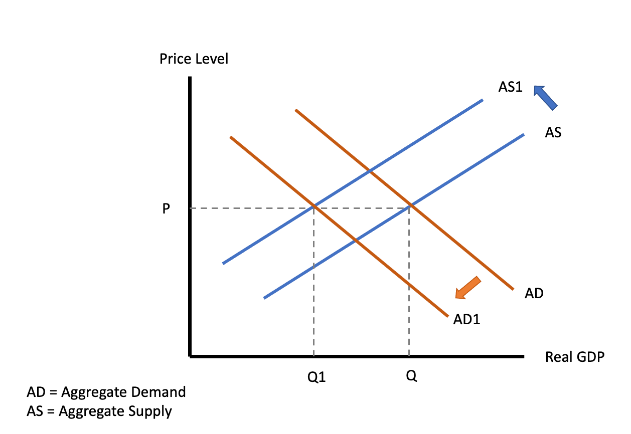
As we were before Covid. Price level as well as real growth in equilibrium by definition. Nice chart, took time, proud of the colours chosen.
Covid happens. Supply diminishes. Demand evaporates. Growth collapses. Q → Q1. You still with me? Good.
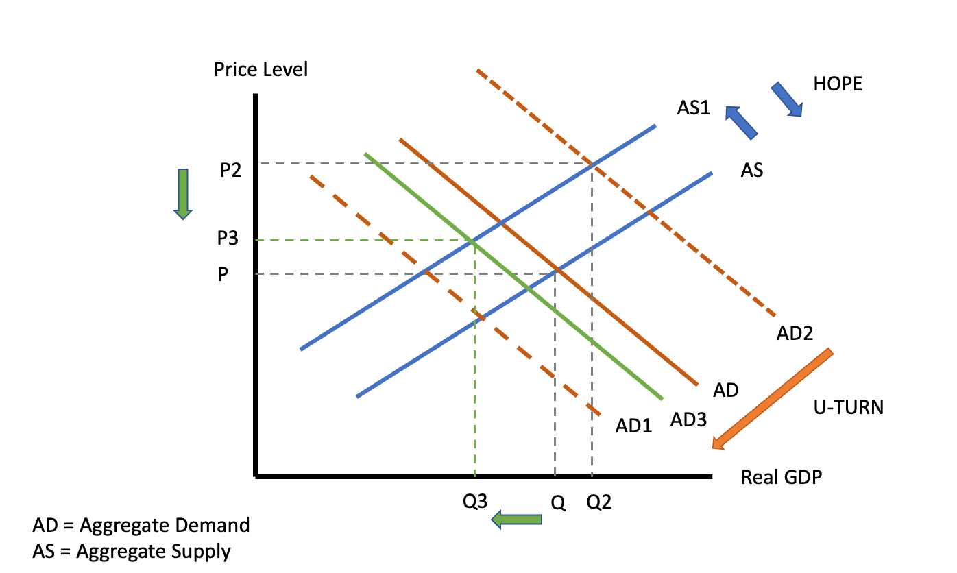
Enter the mighty central banks. Pumping in liquidity to support demand. Yes, goose that curve back up! Here lies the big mistake our esteemed monetary intellectuals made, confusing the supply shock with a demand shortfall which triggered not only unprecedented monetary stimulus through liquidity injections but also massive fiscal transfers to the private sector. So demand gets pushed out AD1 → AD2, which brings higher growth and price equilibrium P → P2 and Q → Q2, resulting in eye-watering nominal growth. Everybody on board? Ok, let’s move on.
Turns out that about a year ago, JPOW and his Eccles building colleagues finally found an intern who might have shown him the above fancy chart. Reverse the engines! Since then, all they have been trying to do is bring back the demand curve D2 via the reduction in liquidity (remember, QE lasted until March!) and pro-active wealth destruction via the raising of rates.
While trying to lower demand via their policies, they are obviously also hoping that some Covid-induced supply issues might force the supply curve back out, helping them lower inflation. Hope didn’t work, Ukraine happened, and China is locking down. What next?
If you followed the script, I probably don’t have to spell the conclusion. With supply still constrained by either external or internal factors (energy policies), the only solution is to crash demand to retain price stability which will inevitably result in a recession. I know it’s a busy chart, but that’s P2 → P3 and Q2 → Q3. “Sad trombone plays”.
As in all economic things, this is a multi-stage process that will take time to evolve. We are clearly in the process of the dynamics in this last chart which has quite a few investment implications.
Remember, nobody knows where r* (neutral rate) should be to bring demand and supply back into balance. We are clearly not there yet, and JPOW and the gang are focused on rapidly using their tools to get inflation down. They were too late, and they will probably overdo it and therefore cause a more severe recession than would have been necessary.
This roadmap leads me to two broader investment conclusions:
Don’t be overly greedy in your risk allocation, be that Equities or anything highly correlated to them.
Fixed Income (Bonds) will soon be a buy and most likely return to their risk-off characteristics.
I shall return with a more detailed discussion on investment implications soon.
For now, I hope you enjoyed this first little piece. Writing is fun but creating those charts is less so. We all are learning; I hope you did take away something. I certainly did.
Oh yes, music! One of my favourite soundtracks for a film is “Into the Wild”. I think you’ll like this song, guaranteed.
Yours truthfully,
Paper Alfa


Thanks for this great read! Looking forward to more of your Paper Trails :)