

Friday Chart Book
December 6, 2024

Bond yields have declined over the past few weeks, and I am writing the following paragraphs before the US payroll report. US Treasuries are generally lower across the board, as the chart of western 10-year yields below shows. Our asset allocation model also returned to bonds after staying on the sidelines since mid-September.

The lowest line in the above chart is that of the Swiss 10-year yield, which has led to new lows of just around 20 bps. There is an air of ZIRP and negative rates in the air again.
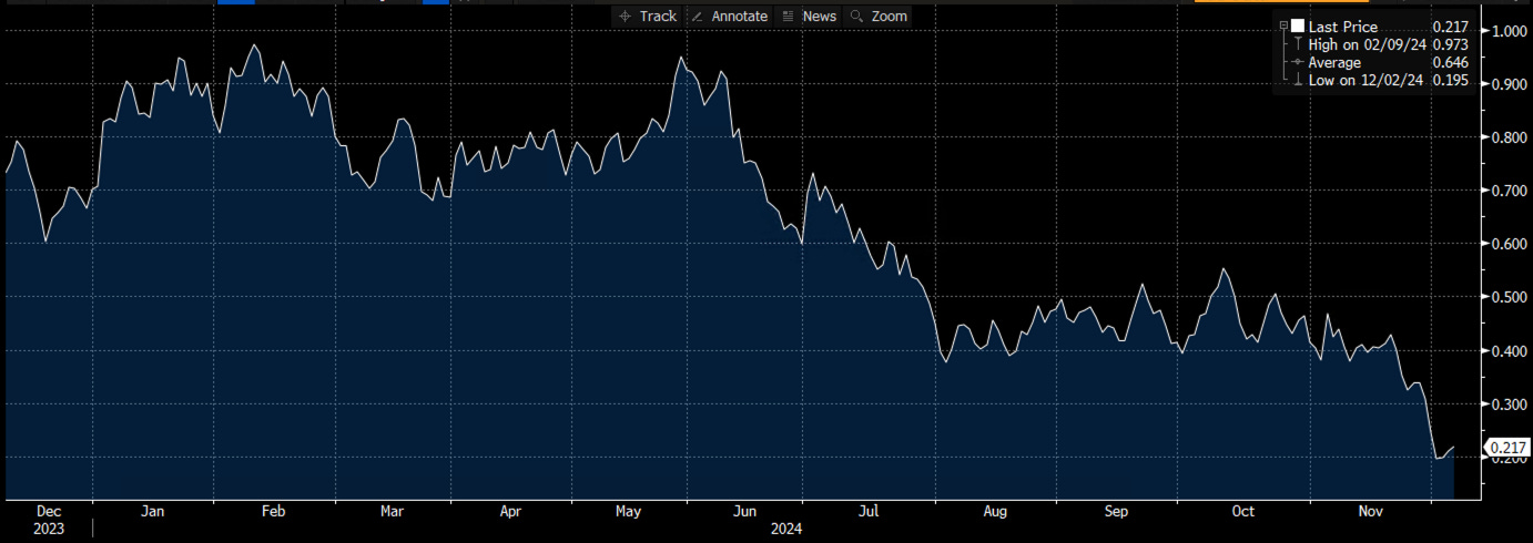
The SNB is meeting next week (12th), and the market has them at a 50% chance of cutting 50 bps. 1y1y OIS is bang at zero. Since the election, bond markets have changed the narrative and de-anchored somewhat from the US bond market drum. There are now actionable macro movements in play, which force each central bank to recalibrate its monetary policy to domestic issues.
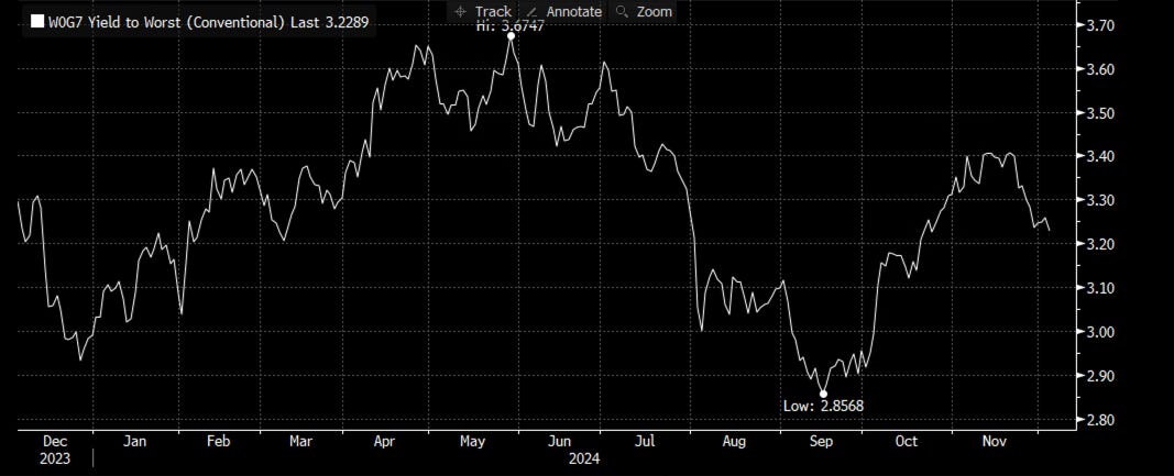
Below is the aggregate yield of a G-7 bond market index, which is weighted to higher-debt countries. On an index level, I could envisage us going another 20 bps lower in the coming months.
The re-focus on domestic policy and diverging macro environments has driven FX implied volatilities back close to the highs where they printed before the election.

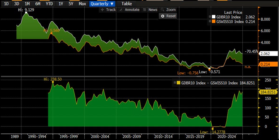
The immediate implication of the Swiss bond yield raises the question of where European yields are headed. After all, the Swiss and European economies are closely aligned. Indeed, the spread of German to Swiss bonds has rarely been higher if go back 30 years (see chart below). Which yield is wrong? Given the current macro malaise of Europe, I would think that European yields should go lower, much lower.
The ECB, however, is still focused on its own inflation mandate, which is inherently backward-looking. The chart below shows the general correlation of Swiss, German, and EU inflation rates over time. I would expect European inflation, despite the recent pick-up, to continue its trajectory lower.

EU 2y2y inflation swaps, meanwhile, are collapsing, indicating a certain urgency for Madame Lagarde to cut rates.

European terminal rates (2y2y below) of just below 2% still look too high in the larger context. They need, of course, the Fed to continue cutting into next year and by more than is currently priced.

There is the EUR/USD exchange rate as well, which has already recently fallen sharply to reflect the diverging economic realities between the US and Europe. Zooming out and considering the chart below shows that the EUR/USD rate is pretty much at similar levels as it was 10 years ago. Can it go lower? Sure, parity isn’t far.

If you have followed all the above and know the macro narrative of the US and Europe, the chart below should surprise you to see the DAX, while underperforming the mighty SPX, still printing new all-time highs. Maybe, not everything is as bad as we think and a lot of bad news is priced in?

The broad implication of countries outside the US economically weakening would be that the US can’t stay isolated for too long. I will cover US exceptionalism in a different post. There are parallels with Reagan’s “Imperial Cycle” of the 80s, which triggered a boom in equities and the Dollar with higher rates, which sowed the seeds of its own downfall as foreign countries weakened and ultimately caused the boom to bust. George Soros covered this in his phenomenal book “Alchemy of Finance”, where he presents his theories on financial markets, reflexivity, and the broader dynamics of political and economic systems. While the book primarily focuses on market behaviour, Soros also touches on the cyclical nature of empires and hegemonic powers, offering insights into their rise, peak, and decline. This aligns with his broader imperial cycle thesis, which explains how nations or empires overextend themselves and ultimately face decline. Anyway, more on this soon.
By now, most of you will be familiar with the models and their signals. If not, please study the guide I have published. I would highly recommend you go through these notes and guides if you are new to the pack. I am also in the process of making an intra-day model available soon. It’s in the works.
Further below, the full book of 250+ charts covers the whole asset spectrum from equities, bonds, commodities, FX, and Crypto to give you the most extensive view. On average, it will generally provide a good 5-10 set-ups on a weekly basis. The Trial is still open so if you are curious, this is the time to try it out.
This is a reminder that you can now also use my models in TradingView scripts, which I made available for subscribers to use on their charts. This is not for free and incurs an additional cost. I am also in the process of making one of my intra-day models available. This will come at no additional cost to existing users, but new admissions will see a price increase. If you are interested, ping me an email with your TV username. Note that only paying subscribers will be granted access. No exceptions.
Let’s also read my friend Macro D’s recent thoughts on markets before engaging our scanning eyes across the multitude of charts that I have updated for you below.
