

Friday Chart Book
July 6, 2024

First off, the outcome of the UK’s general election came as no surprise to anyone. While Labour optically looks like they have won by a landslide, the underlying story is painting more of a picture of a devasting loss by the incumbents with a rise of more right-wing parties as a result. Initially, GBP and UK assets showed some relief rally. I remain sceptical, especially when it comes to politics. Having listened to Keir Starmer, it just strikes me that the strategy of “change” is just a lot of fluff. There were no concrete plans in the manifesto that struck me as innovative or particularly beneficial to the current narrative. I am happy to give any new government the benefit of the doubt, but deep inside, I am cautious to embrace an outright more rosier picture for the country I call my home.
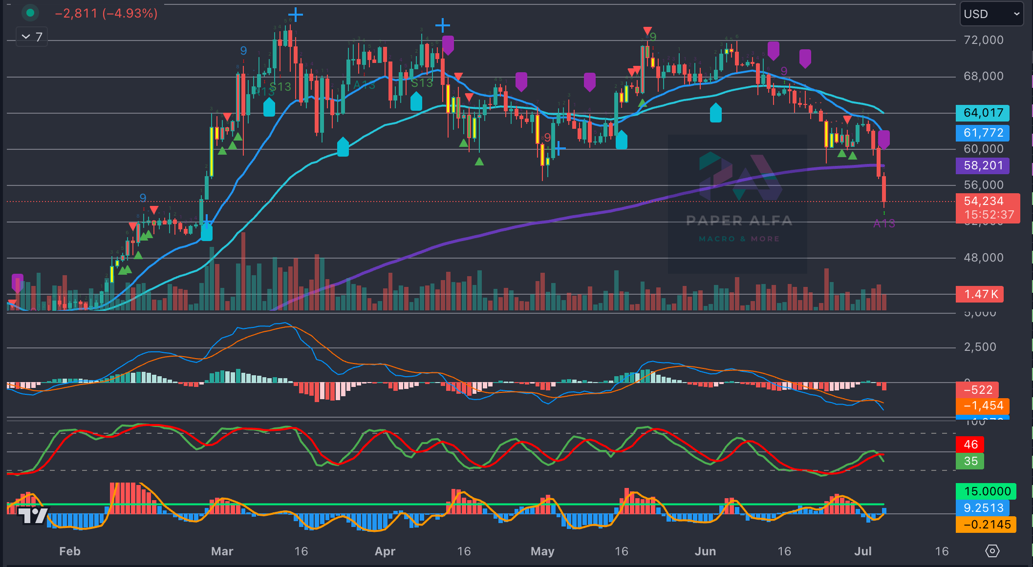
BTC and the entire crypto complex aren’t feeling the love as of late. The much-anticipated halving and ETF launches now seem distant while we are scrambling for a new narrative to form. The model has been short BTC since mid-June after it broke below the 50 ema at around 67k, and it just printed another short marker as we sailed through the 200 ema support. The 52k breakout floor from March now looks very likely to mark the next support.
Meanwhile, the bond market is coiling around a small breadth of optionality in what the next six months have in store for us. Let’s have a closer look (these charts/numbers were produced before the NFP print.
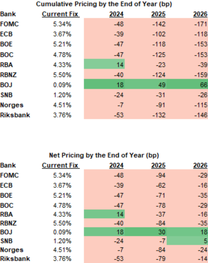
The FOMC / BOC / BOE are pretty much equally priced for the remainder of this year, with the ECB roughly 10 bps behind. The dispersion, as one would expect, widens 1 and 2 years out.
What looks off to you? Of course, the Fed is dictating the speed, and the ECB / BOC has already eased, but I am very convinced that the realisation of those paths will be quite a bit different by December 31.
Visualising the above gives us the following chart, with the JPY and CHF OIS curves being the obvious outliers.
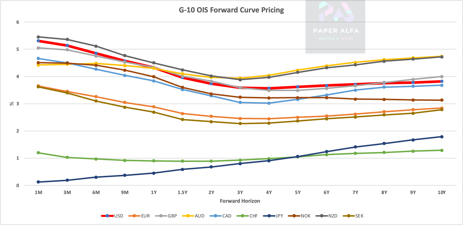
The perfected synchronisation is even more observable when plotting the cumulative pricing, with the AUD curve also standing out as small probabilities for 2024 hikes are still being priced.

Also, read my piece on de-synchronisation for further reference.
The initial response to the higher-than-expected NFP number was bullish for rates, which have taken the revisions of more than 100k over the past two months as a signal that the labour market is slowing but very modestly so, which can all change rather quickly.
The jobless rate was up to 4.1% from 4.0% in June due to higher participation. Earnings growth cooled to 0.3% from 0.4% the month prior. Government jobs made the difference. Service related jobs like retail and leisure seem to have cooled off, adding to the narrative that we are seeing further evidence of labour market softness and with it the forward looking inflation picture.
Let’s now read Macro D’s latest thoughts. We then turn our attention to the charts. By now, most of you will be familiar with the models and their signals. If not, please study the guide I have published.
The full book of 250+ charts covers the whole asset spectrum from equities, bonds, commodities, FX, and Crypto to give you the most extensive view. On average, it will generally provide a good 5-10 set-ups on a weekly basis.
A reminder that you can now also use my models in TradingView scripts, which I made available for subscribers to use on their charts for a fee. If you are interested, ping me an email with your TV username. Note that only paying subscribers will be granted access. No exceptions.
Let’s go
