

Friday Chart Book
February 16, 2024

Yes, I thought I’d change the name of this weekly regular and give it a new look. It’s still a testing phase until I settle for something, so bear with me. Shout out if you have any cool ideas. Paper charts doesn’t sound that appropriate anymore. After all, there are no paper charts involved. It’s also taking a bit of reflection on how far those charts and their application have come.
Roughly two weeks ago, I made those charts available for those who are using TradingView. The feedback has been awesome, and I am even more pleased to hear that it has led to some personal trading successes. Long shall it last.
For those who are not aware, I am making those charts available for those who are interested. Please get in contact with me if you would like to be granted access.
This week has seen a good setback in bonds, which the model correctly anticipated. We also still caught the long USD momentum intact while we had a brief indication of oversold conditions in certain equity indices earlier this week.
Talking of equities, I came across an excellent presentation of the ever-interesting Jim Reid of DB. I’m sharing some of the most notable charts below.
Maybe it's not surprising, but we are indeed reaching historical levels of concentration in the US stock market. Is mean reversion on the cards? It is not a given, but it is certainly increasingly leading to potential financial stability issues. What can go wrong!?

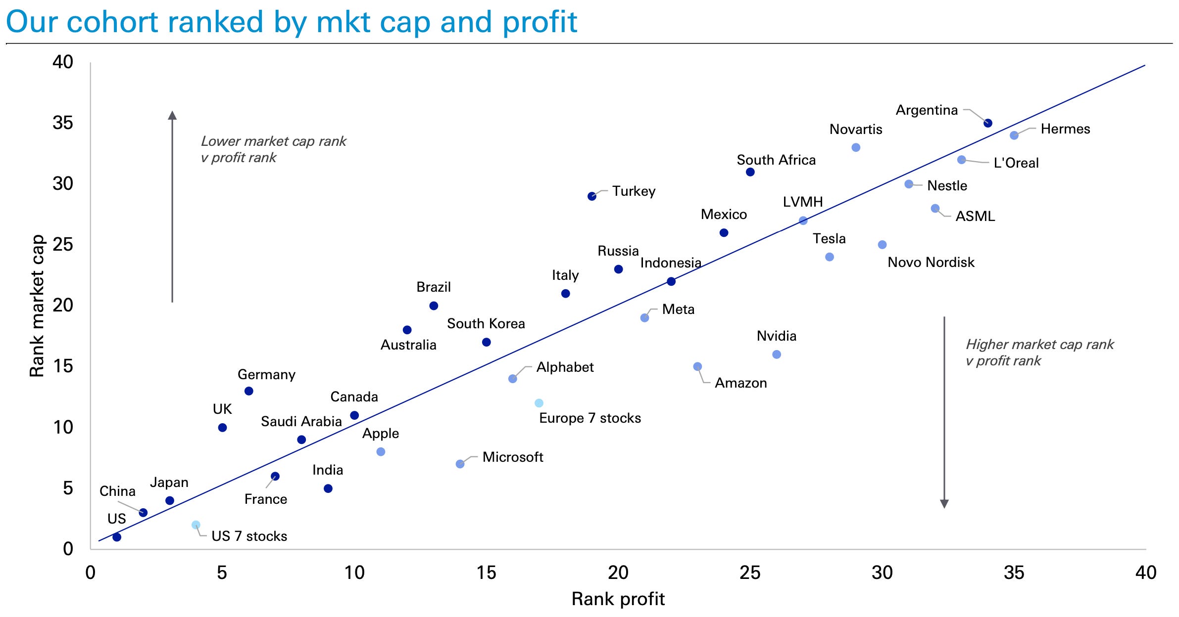
Another good chart plots the market cap rank vs. the profit rank. You can see the stocks in question relatively far from the trend line, indicating their lofty valuations. Short NVDA, Long Turkey, anyone?
Of course, the watchword of all current exponential things is network effects, which speak to the fast adoption rates globally compared to any other technology previously introduced.

How long this will continue while the rush into those stocks continues could be anyone’s best guess.
Maybe it's a good time to re-read one of the great books out there.
Let’s now focus on what’s immediately in front of us. Let’s scan through the 100+ charts which rightfully give this post the name “book”. What started as maybe one paper and page has now morphed into something way more substantial.
Let’s go!
