

Global Macro Dashboard Update
Q1 is done and dusted

The month and quarter have ended, and what a first three months we have seen. A war and a truckload of Tacos have been delivered. There seems to be no end in sight, although just as the quarter has come to an end, hopes of a peace deal have emerged, conveniently set after the European market close as volatility evaporates. Coincidence or an attempted pump to mark up the book? We will never know. Nothing suggests a change in tone while assets are still being deployed to the region.
What is the Dashboard?
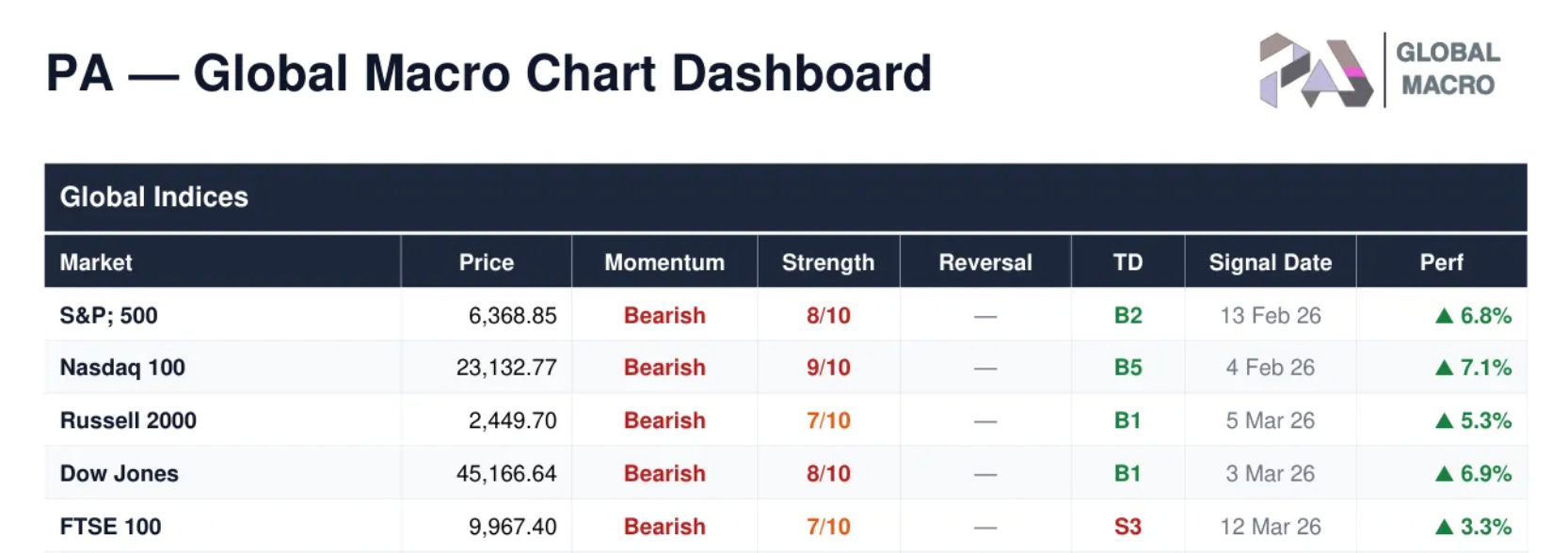
The PA - Global Macro Chart Dashboard is a daily technical analysis summary covering ~200 securities across 9 asset classes: global equity indices, US sectors, US & international stocks, ETFs, fixed income, FX, commodities, and crypto. It is generated after market close and provides an at-a-glance view of trend direction, momentum, reversal signals, and sequential counts for every instrument.
Each row shows you the trend direction (Momentum), how strong it is (Strength, scored 0–10), whether a potential turning point is forming (Reversal), and where the market sits in its exhaustion cycle (TD). Signal Date and performance track when the current signal fired and how it’s performing since. For the S&P 500, for example, the momentum short was initiated on February 13th and has since generated a 6.8% return.
Let’s now check out the full dashboard. I hope subscribers have found it useful in navigating the recent weeks.
Let’s go straight to it.
