

Global Macro Dashboard + Chartbook
Equity / ETF / Sector / Stocks / FX / Rates / Commodities / Crypto

I have updated the dashboard and chart book with Friday’s closing prices. This is a new tool I introduced a few weeks ago, aimed at helping subscribers spot momentum and reversal changes that my models are highlighting.
Thank you for all your feedback. There is more to come, as I am working to expand the offering by introducing additional features and tools. I’m excited about what is to come. All current paid subscribers will receive every new feature and tool we build at no additional cost — your rate is locked in permanently. However, our pricing structure will be changing as new features are introduced, so if you've been thinking about subscribing, now is the time to lock in the current rate before this offer closes.
What is the Dashboard?
The PA - Global Macro Chart Dashboard is a daily technical analysis summary covering ~200 securities across 9 asset classes: global equity indices, US sectors, US & international stocks, ETFs, fixed income, FX, commodities, and crypto. It is generated after market close and provides an at-a-glance view of trend direction, momentum, reversal signals, and sequential counts for every instrument.
Each row shows you the trend direction (Momentum), how strong it is (Strength, scored 0–10), whether a potential turning point is forming (Reversal), and where the market sits in its exhaustion cycle (TD). Signal Date and performance track when the current signal fired and how it's performing since. For the S&P 500, for example, the momentum short was initiated on February 13th and has since generated a 6.8% return.
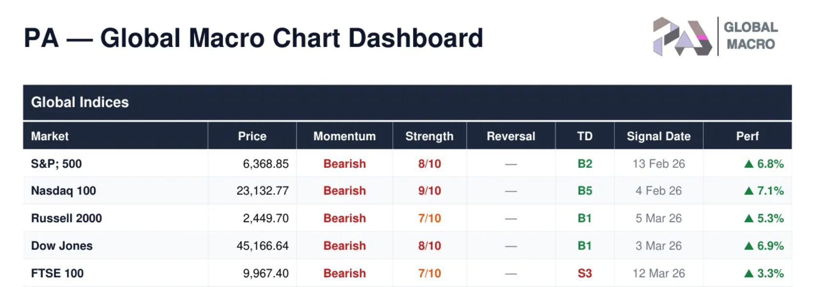
Let’s now check out the full dashboard and accompanying individual charts.
