Friday Paper Charts
December 1, 2023
Month-end came and went. The usual noise is screaming through our screens without much signal to act on. US core PCE printed in line with consensus estimates at 0.2% MoM. The upward trend in continuing jobless claims is more worthy of our attention. It is, however, important to note the series’ volatility around holiday periods.
Powell’s speech today could lean against some of the members' most recent dovish talk. Would we blame him after a monster month in the easing of financial conditions? It wouldn’t take a reasonable person long to conclude that markets have gotten ahead of reality here. And the Fed will certainly take note, especially as the tightening of financial conditions was previously used as an argument to delay further rate hikes. Will policy workings remain symmetrical? We shall see.
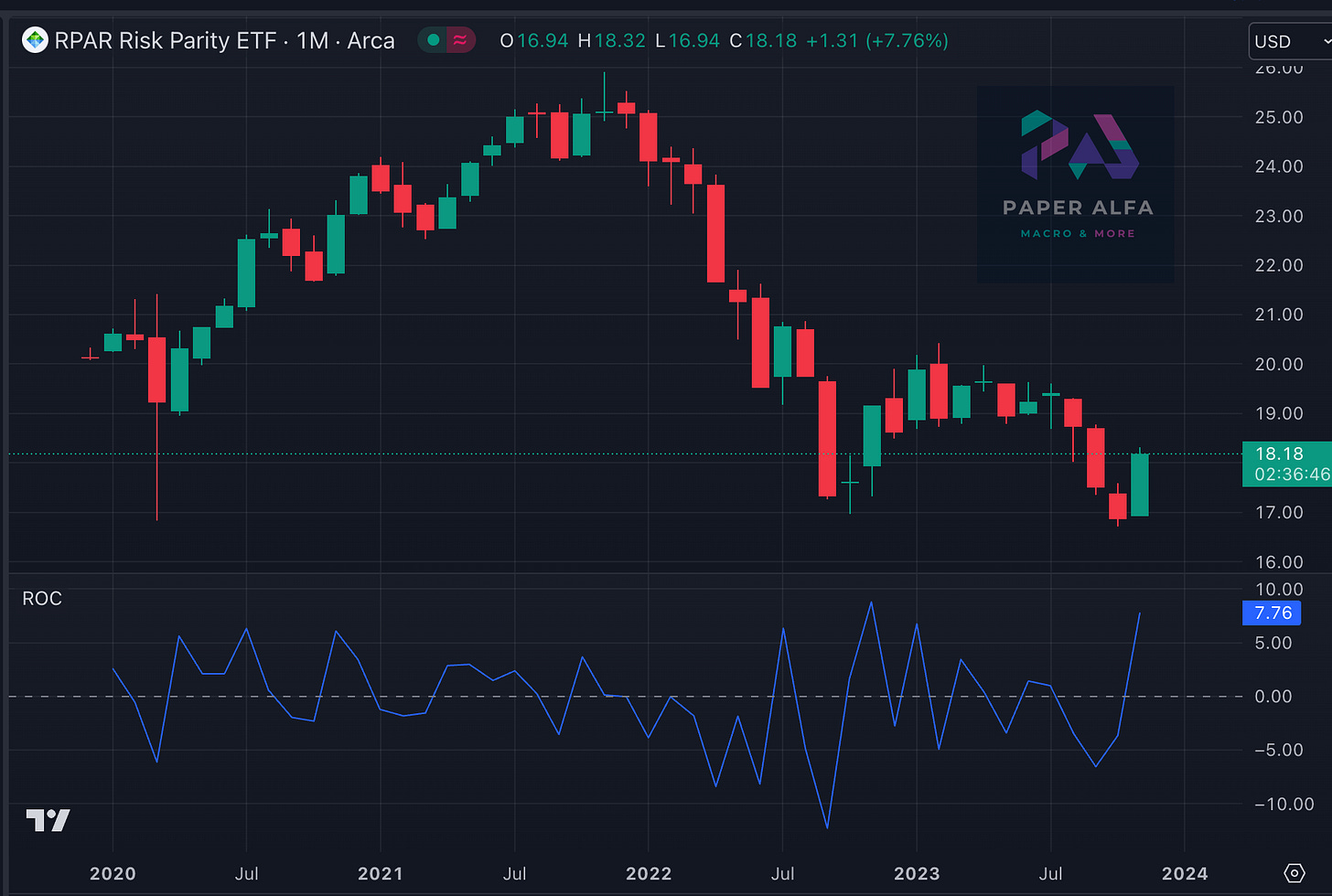
Taking a risk parity ETF as a proxy for financial conditions would highlight the largest YTD gain, similar to the gains from a year ago.
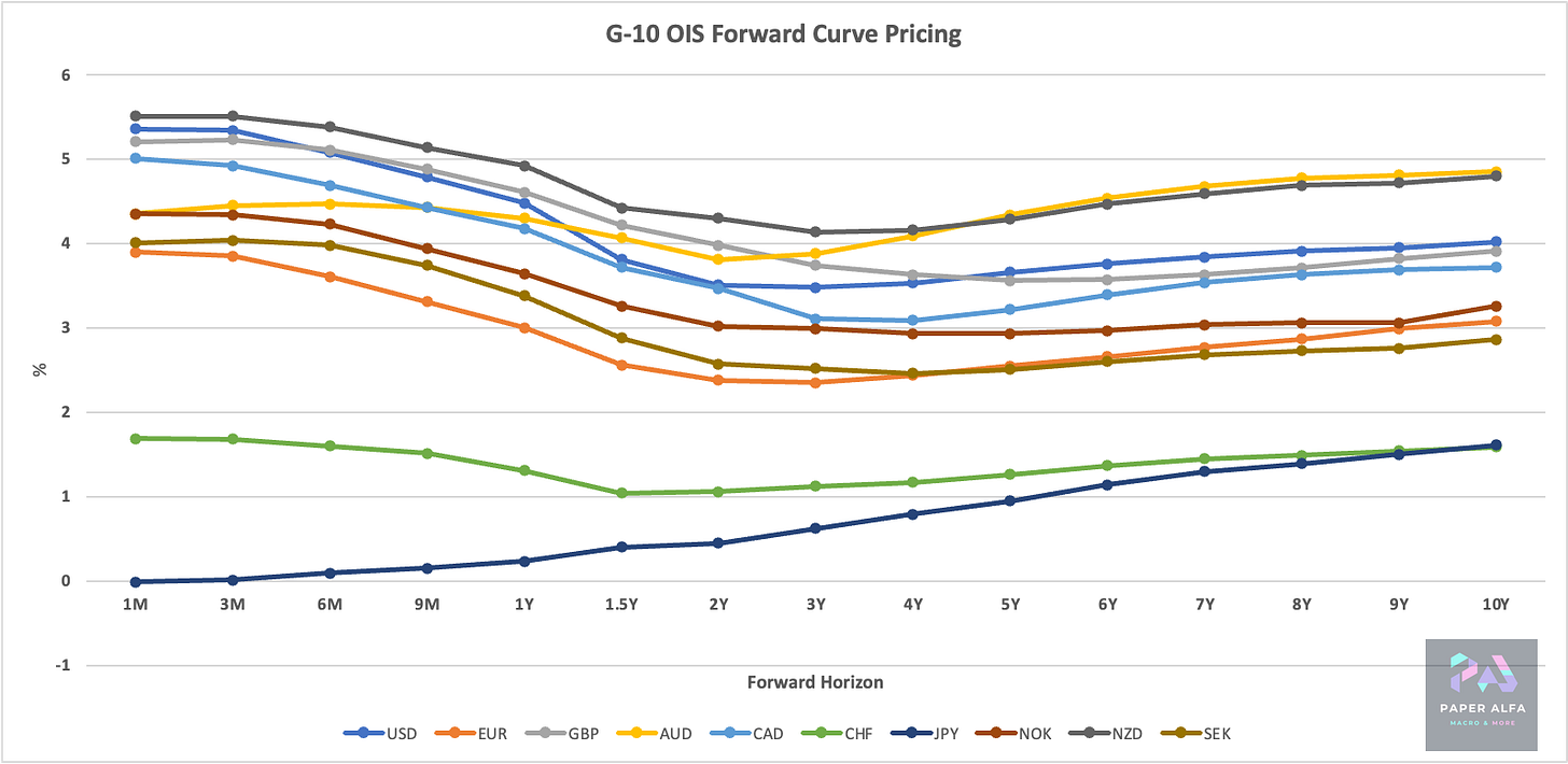
Where do we stand in front-end pricing? Let’s have a look. Looks like a very synced wave aside from Japan and Switzerland.
How much is that cumulatively? See below. Over the next year, roughly 100 bps of cuts are priced for the US and Eurozone.
Let’s now go straight to the charts. There is plenty to go through. 103 charts, to be precise, and there are more coming. We have quite a few new interesting reversal signals flashing.


