Friday Paper Charts
September 29, 2023
Another gruelling week has passed. At least we are finally checking out for the month and third quarter. Forget economy data, which has been downgraded to the back burner for now. This is all about positioning and finding more pain points in the market, which has woken up trying to shake off your PnL in front of your eyes. My mantra of staying nimble, especially in today’s market, should be taken seriously. This is no market for weak hands; this is getting fun, and real opportunities are knocking for those who are ready to endure some pain with it.
As Rocky’s nemesis once said:
Interviewer:
What’s your prediction for the fight?
Clubber Lang:
My prediction?
Interviewer:
Yes, your prediction.
Clubber Lang:
Pain!
Things are moving to pain levels. Taking USD/JPY as an example is reaching levels where everyone and their dog expect an imminent BoJ intervention. BoJ first intervened pretty much a year ago, with Japan's MoF confirming they had spent JPY 2.84 trillion (~$ 19.5bn) intervening. Back then, the BoJ appeared to use cash holdings for intervention purposes, with the Fed’s weekly balance sheet data showing the foreign RRP holdings dropping by $24bn to $271bn during the week.
US 2-year swap spreads (green line below) saw a pretty strong reaction last year during the intervention as treasuries sold off relative to corresponding swaps. This time, while at lower levels, spreads have again started coming in.
Then, of course, we have the ongoing sell-off in bonds, which seems to be accentuated during US trading hours. My longer-dated charts using monthly candles and multi-month Bollinger bands highlight pretty stretched levels for US 30-year yields. This is also confirmed by a very extreme RSI reading, not witnessed for nearly 2 decades. Equally, the multi-timeframe KST oscillator seems to have shown a rare crossing recently. This is all indicating a soon-to-be-reached top for long-dated bonds, although looking at monthly candles might be too long-term for some of us.
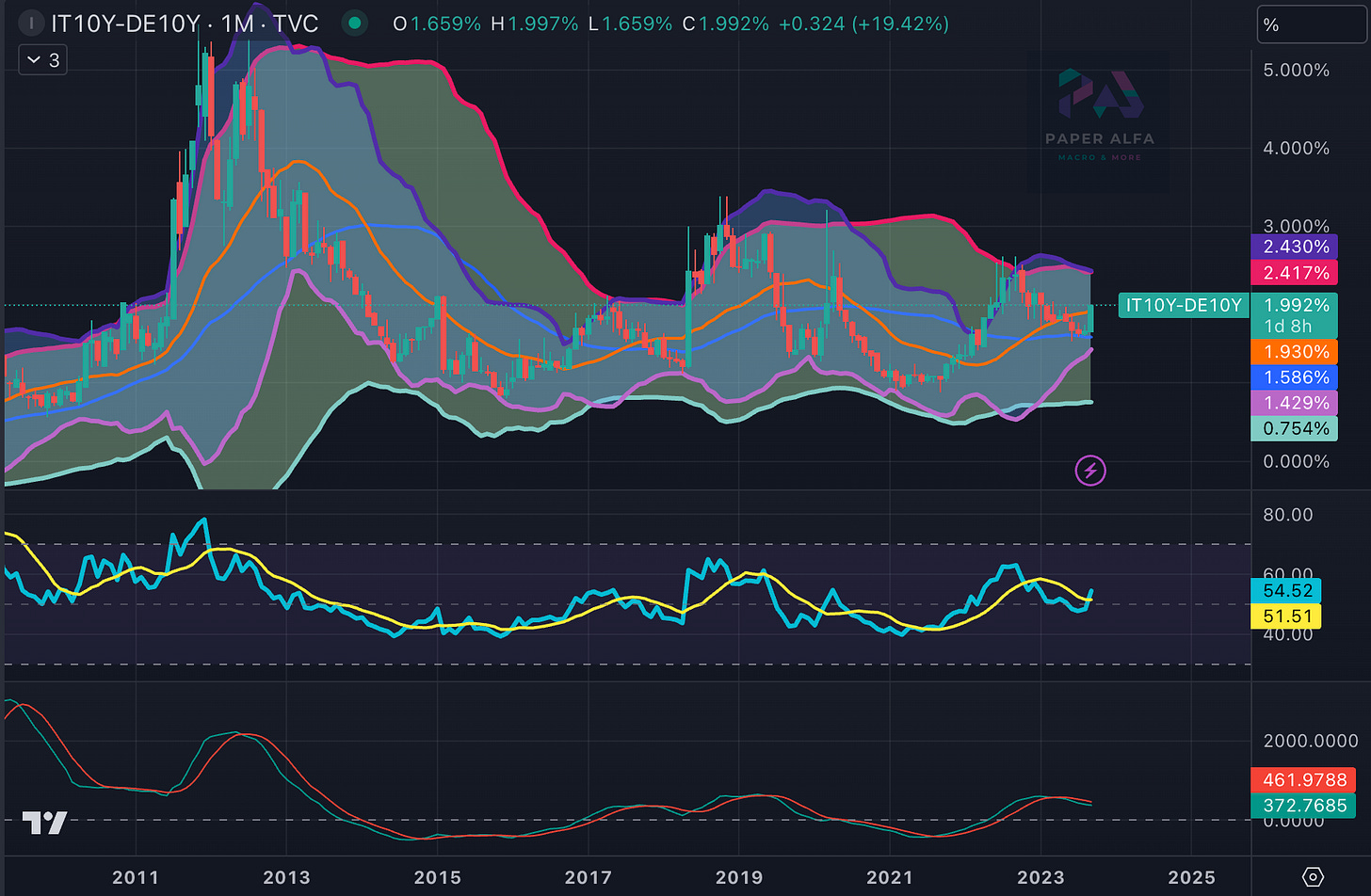
Italy is once again in the news as its fiscal deficit forecast is higher than previously anticipated (the 2023 deficit projection will be 5.3% of GDP and 4.3% for 2024). If we are talking about worries of deficit in Fiat reserve currencies, we can certainly also look at fiscal dynamics in quasi-centralised Europe. Spreads have widened, and looking again at longer-term charts would suggest we are just at the midpoint of the recent trend.
Joining the pain trade higher in yields is also visible in selected EM countries, such as Brazil, where 10-year yields have bounced nearly 100 bps over the past quarter. Better than anticipated growth, as well as ebbing out of disinflationary trends, has put a question mark on where ultimately monetary easing will end.
It’s also worth considering the correlation indices as obtained by the CBOE. In short, the implied correlation can be seen as a gauge of herd behaviour. It is the market’s expectation of future diversification benefits. It measures the average expected correlation between the top 50 stocks in the SPX index. The interesting bit is how usually the 3-month index lags behind the more volatile 1-month component. This time, however, both are broadly moving in tandem, which is more similar to the episodes we witnessed in last year’s high volatility period. Overall, however, both indices are still on relatively subdued levels.
Taking it all in, we are in a bit of a mini-storm. Luckily, the momentum of recent moves hasn’t really surprised the momentum model, while the reversal model, given some of the sharp moves, is warning us of some reversals coming up. It flashed a rate reversal last week, for example, which only lasted a day. We had some relief yesterday in bonds and equities, but will it turn into a momentum change?
Let’s now look at all charts in order to assess what’s likely going to transpire in the days and weeks ahead. There is a new record of 94 charts included in the deck. I have now started including a selection of single-name stocks on the list, and I will expand it going forward.


