Friday Chart Book
August 2, 2024
The tides are turning, and they have been spinning fast. What has been a ferocious ending to July, with bonds and equities ripping, saw equities reverse sharply lower on Thursday while bonds put in another face-ripping rally. This is vicious price action in bonds. Worse than anticipated ISM and its employment sub-index triggered growth fears, something equities markets would have saluted only a few weeks ago. Why? Now that we know that the Fed is cutting, this certainty has given way for equities to focus on the severity of the slowdown ahead. Whether this is premature is the golden question here, as a mere slowdown from quite elevated levels is hardly surprising. This is setting up the market to possibly anticipate the dreaded R-word a little bit too soon and too fast. But you can’t stand in the way as reflexivity takes hold as a further fall in equities sets the FCI loop into a reversal, which, as we know, will inevitably also have an impact on spending on hence real economic outcomes. Markets always move ahead of data. Can they overshoot? Absolutely, but in my experience, environments like today’s are not for catching falling knives. If uncertain, reduce risk or stay in cash. Staying nimble is key.
With the velocity of recent bond moves, especially in front-ends, I have updated the below charts to see what’s changed across the G-10 spectrum. These were taken on Thursday, updated charts are found further below.
Below is the spot OIS G-10 curve by country, which shows the anticipated easing, with the exception of Japan.
For simplicity, I have changed the delta so you can glean what is priced cumulatively across the curves. The US, for example, is the thick red line, which shows a 200 bps lower terminal rate on a 3-year horizon.
How does that compare to a month ago? The following chart shows precisely that, with the NZ curve showing almost 100 bps of a change in front-end expectations over the past few weeks, while the US saw a 60 bps adjustment, all on a one-year horizon.
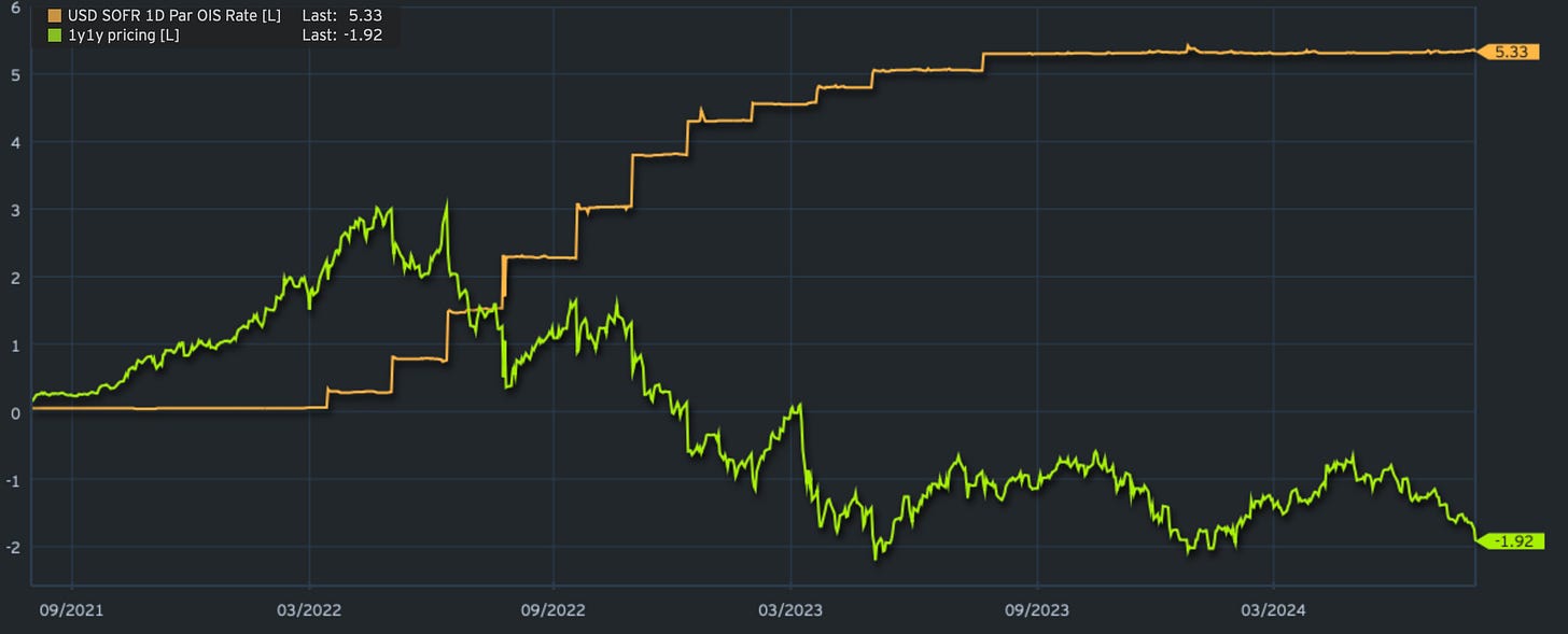
These are relatively big moves, similar to what we have seen on two previous occasions after SVB in March/April 2023 and after Powell’s pivot and its follow-through into January of this year. This time around, you can argue cuts are on the table which were previously not even part of the discussion. If you think that the front-end should at least anticipate similar pricing, the 1y1y rate would have to fall another 10-15 bps. I think there is a high probability we will get there soon.
What comes after that? Of course, a bond rally can continue, especially as and if data comes in weaker. Part of me, however, has seen this movie before, and given the buoyant data and nominal GDP growth of around 4.5 - 5%, I find it hard to get super bullish, although the rate of change is clearly pointing down.
The markets are in flux, and those of you who have followed my models have hopefully caught the long in bonds in time.
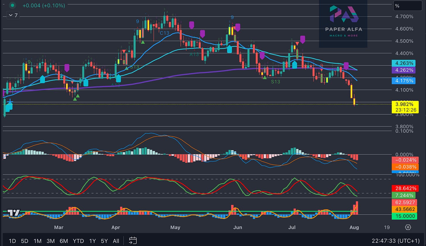
US 10-yields have rallied nearly 40 bps since the models reversed and then shorted yields in early July. Now, they are showing oversold levels, which would normally mean a consolidation higher, although I would wait, given the velocity of the move. Please note that this was written before payrolls. You can also see the timestamp on the chart below.
As for equities and the SPX, for example, the models have been flagging overbought conditions since early July, which then swiftly followed a short signal as we broke support lines. Thursday’s price action, while ferocious, didn’t close below previous lows after failing to trade above the resistance. A break below the previous lows into a close would be bearish and further heighten momentum. Again, this is written on Thursday before NFP Friday.
You will find updated charts for all assets covered further below, with closing prices as of Friday evening. In addition, I have included a few charts further below, indicating what the start of a cutting cycle indicates for various asset classes when looking at historical periods in and out of the first rate cut. Some interesting conclusions for anyone interested.
By now, most of you will be familiar with the models and their signals. If not, please study the guide I have published.
The full book of 250+ charts covers the whole asset spectrum from equities, bonds, commodities, FX, and Crypto to give you the most extensive view. On average, it will generally provide a good 5-10 set-ups on a weekly basis.
A reminder that you can now also use my models in TradingView scripts, which I made available for subscribers to use on their charts for a fee. If you are interested, ping me an email with your TV username. Note that only paying subscribers will be granted access. No exceptions.
Let’s also read my friend Macro D’s recent thoughts on markets before engaging our scanning eyes across the multitude of charts that I have updated for you below.


