

Dashboard / Charts & Signal Update
What Comes Next?

Time for the weekly dashboard, charts and signals update. As a reminder, the new tools are available on our dedicated site at pa-globalmacro.com. Paying subscribers can log in with the email address they used to sign up for Substack.
As flagged last week, momentum turned positive on equities — and the follow-through has been emphatic. This week’s update covers the full cross-asset scan: equities, rates, FX, commodities, and crypto. There are notable shifts forming beneath the surface that deserve your attention, particularly in rates and energy, where the signals are beginning to diverge from the headline narrative.
For the new joiners, a quick reminder of how this works. The dashboard runs my proprietary momentum and reversal models, flagging where trend changes are forming, where momentum is accelerating, and where exhaustion signals are building. These are the same models available to paid subscribers as TradingView scripts. The charts don’t care about headlines, geopolitics, or what anyone said on financial television. They read price, structure, and momentum — nothing more, nothing less. When they turn, you pay attention.
What is the Dashboard?
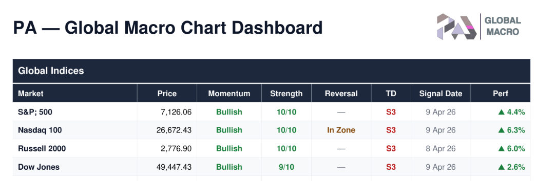
The PA - Global Macro Chart Dashboard is a daily technical analysis summary covering ~200 securities across 9 asset classes: global equity indices, US sectors, US & international stocks, ETFs, fixed income, FX, commodities, and crypto. It is generated after market close and provides an at-a-glance view of trend direction, momentum, reversal signals, and sequential counts for every instrument.
Each row shows you the trend direction (Momentum), how strong it is (Strength, scored 0–10), whether a potential turning point is forming (Reversal), and where the market sits in its exhaustion cycle (TD). Signal Date and performance track when the current signal fired and how it’s performing since. For the S&P 500, for example, the momentum long was initiated on April 9th and has since generated a 4.4% return.
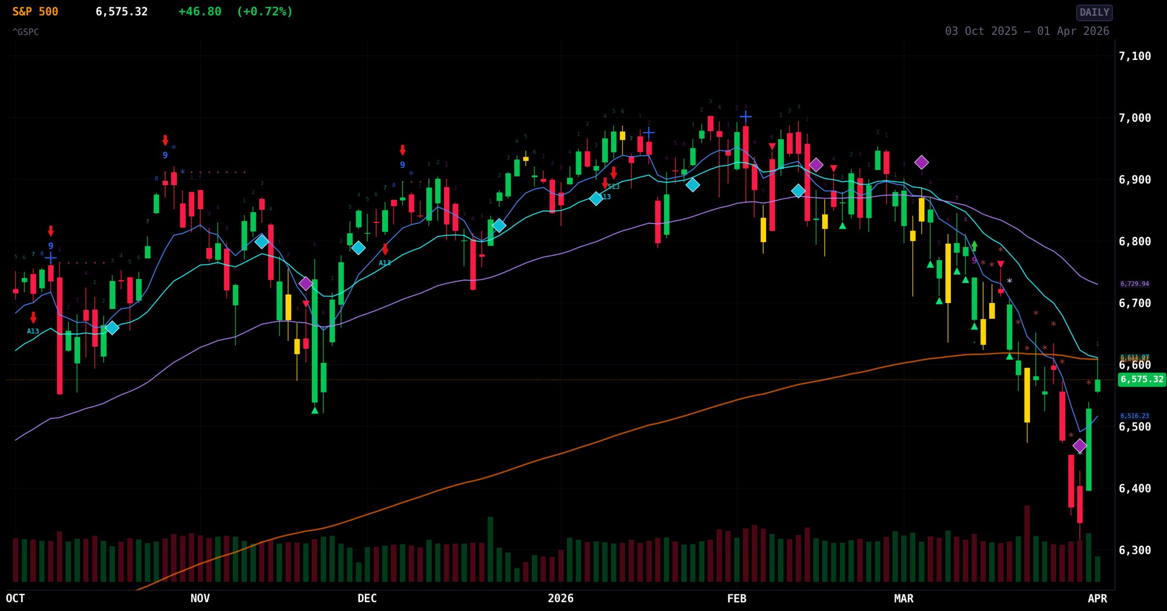
In addition, you will find individual charts for all securities, each including the momentum and reversal model indicators.
As a new feature, I have added a daily run of changes that flags any securities experiencing changes in any of their models.
The best thing is, this is just the start. I plan to add more tools going forward to help you all navigate the road ahead.
Let’s now check out the full dashboard and accompanying individual charts.
