

Bond Market Update
January 8, 2025

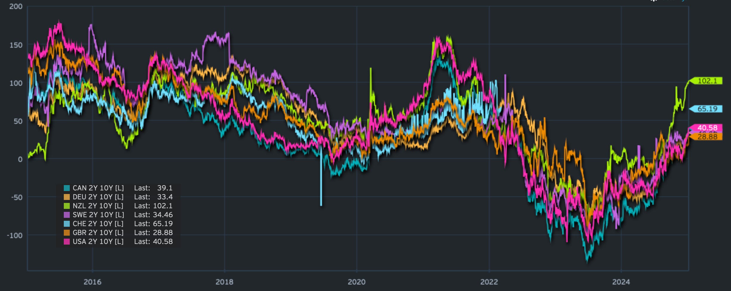
Bonds are in a pickle. What started as a sell-off a few months ago is now continuing with further bear steepening across major market curves. You can see the 2/10s curves for a few developed markets below, which shows the highly correlated move.
I wrote in an earlier post that the general consensus that bonds are attractive might be tested. The 10-year US treasury yield markers at 4.50%, 4.60%, and now 4.70%, came quickly. 5% now doesn’t seem too far-fetched, does it?

Stronger macro data and sentiment are not helping bonds find a footing for now. There is also spillover from other markets that have underperformed the US market, like the UK, where last year’s fiscal announcement is now being tested. Bond vigilantes are getting warmed up. Fiscal and monetary malpractices will always get punished; that’s how markets work. So far, US bond markets are behaving, but could this also infect Treasuries at some point?
Our asset allocation model has been avoiding bonds for a while now, and our charts still point to further weakness. What’s next?
Let’s explore and look at some charts.
